

Creative consultancy Culdesac has designed a store for supermarket chain Consum in Benicàssim, Spain, with simple, stripped-back interiors to make the shop’s arrangement understandable.
Valencia-based Culdesac designed the arrangement, signage and furniture of the store, which will serve as a model for Consum’s future shops, to be clearer and easier to understand than traditional supermarkets.
“Stores should be designed in order to make shopping easier,” explained Borja Berna, senior creative architect at Culdesac. “To help people and to make them travel in store in a comfortable way.”

To do this, Culdesac has simplified the store’s interiors by removing “visual noise” such as aerial signage.
“This design was about figuring out which kind of elements were disturbing and deleting them, making only elements that were going to help shoppers,” Berna told Dezeen.
“We deleted noise and focused on the essential issues. Colours, signage, lights and communication had to create a happy visit to the store and, at the same time, create the brand image.”
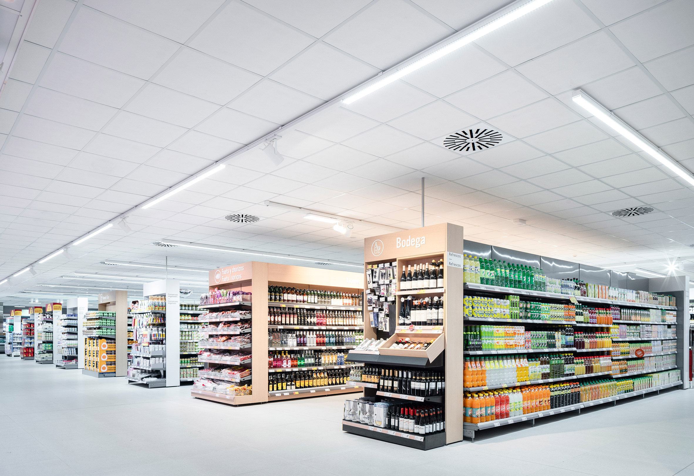
Within the store the different sections have been arranged according to an organisation chart developed by Culdesac and Consum, within a strict geometric arrangement.
“We’ve created an organistional chart: most important areas, corridors and head places, perimeter, and cashier area,” explained Berna.
“Each part has been assigned a graphic design according to the scale in space, but the most important is that all of them are in line with each other.”

Throughout the interiors, natural tones have been combined with Consum’s orange branding.
“Colour has also its own function,” said Berna. “From a distance, it helps to define large areas and the cashier area. Orange is the brand colour, so the starting point is a welcome area in orange.”
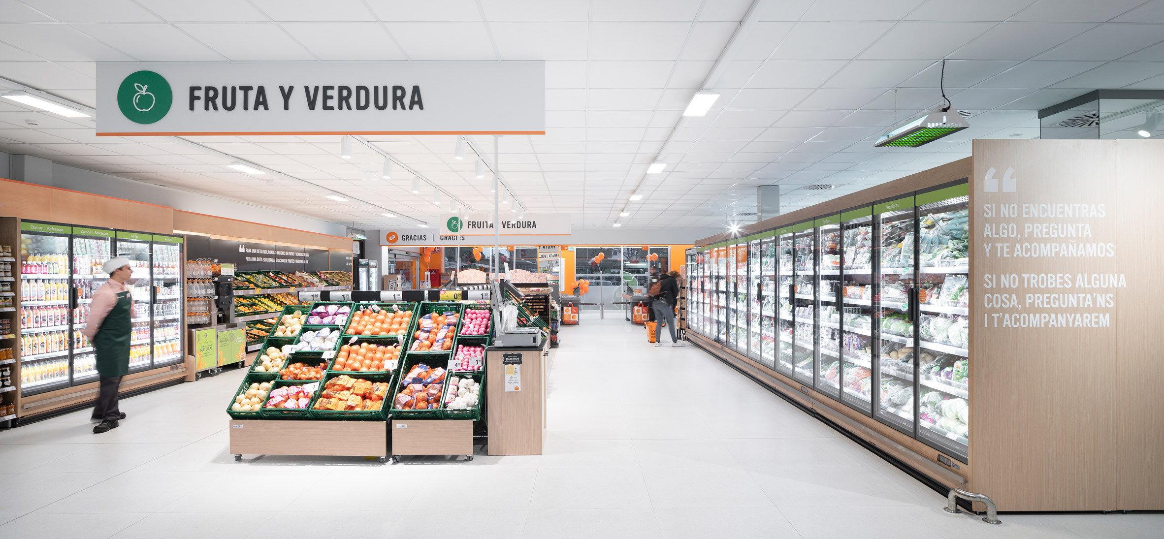
“An orange line connects the whole space, so this colour is never lost,” continued Berna.
“White allows us to create a warm, clear and close space. Moving away from techno spaces and getting close to a familiar, friendly store and shopping experience. Black lettering is also the best way [for shoppers] to read.”

The design implemented at the Benicàssim store will be used at future Consum stores and will begin to be implemented across the chain’s 680 supermarkets in Spain.
Photography is by David Zarzoso.
The post Culdesac designs coherent interiors for Consum supermarket in Benicàssim appeared first on Dezeen.