
homecore, the paris-based streetwear brand, has commissioned studio malka architecture to design its new store on les champs-elysées. the project is inspired by the design of the krylon spray paint can, as well as graffiti culture in general. the design also refers to a quote by dutch artist theo van doesburg, who, in 1924, said: ‘the new architecture permits colour organically as a direct means of expressing its relationships within space and time.’
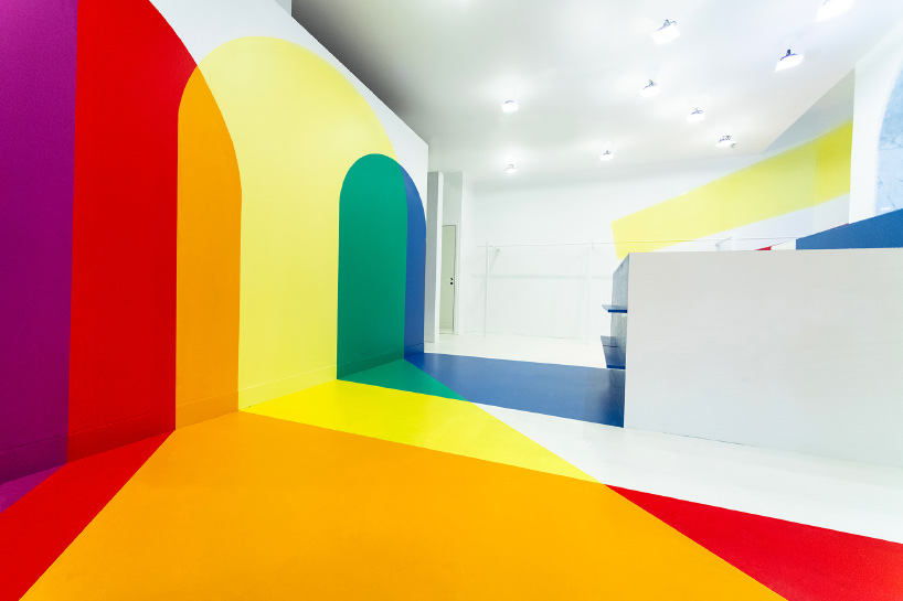
image © laurent clement (also main image)
the store’s external façade is defined by seven arches that feature bold statements — such as ‘peace’, ‘love’, ‘unity’ — that reflect the brand’s philosophy. these arches also serve as the origin of the chromatic axis that crosses the homecore store. the openings have been conceived as a prism that disperses white light into the spectrum colors. this turns the volume into a chromatic space, where vivid tones and hues intersect. primary colors such as red and blue overlap to make secondary colors such as purple.
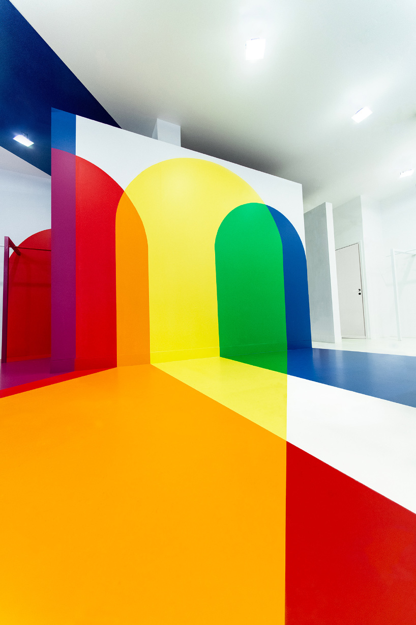
image © laurent clement
‘this project is a three-dimensional representation of the chromatic circle, and gives tangible form to the immaterial space of the spectrum, where the color structures the space just as a material,’ explains studio malka architecture.
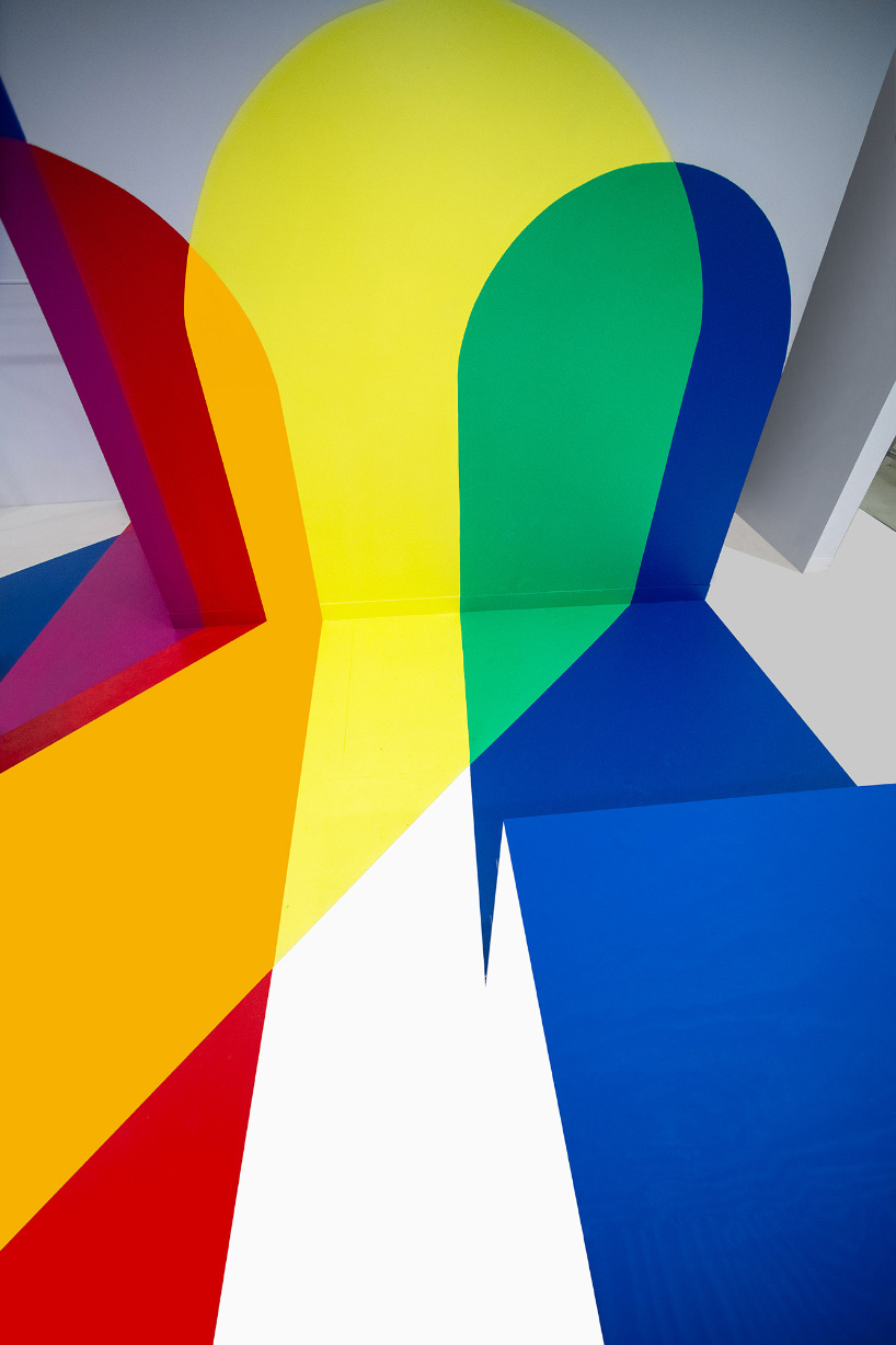
image © laurent clement
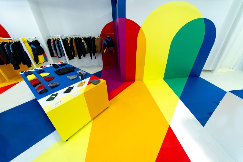
image © laurent clement
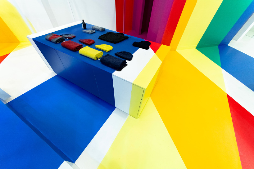
image © laurent clement
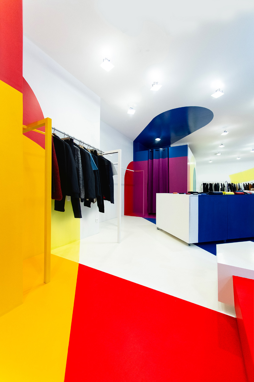
image © laurent clement
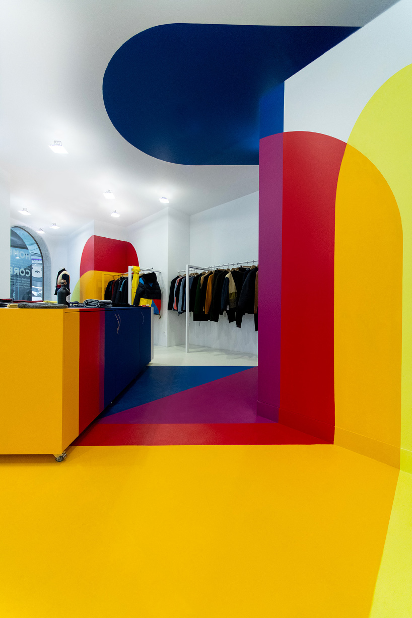
image © laurent clement
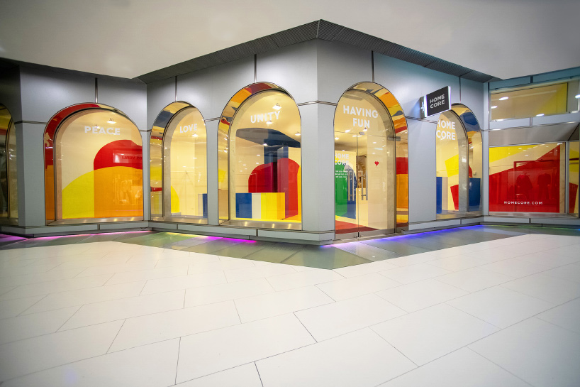
image © laurent clement
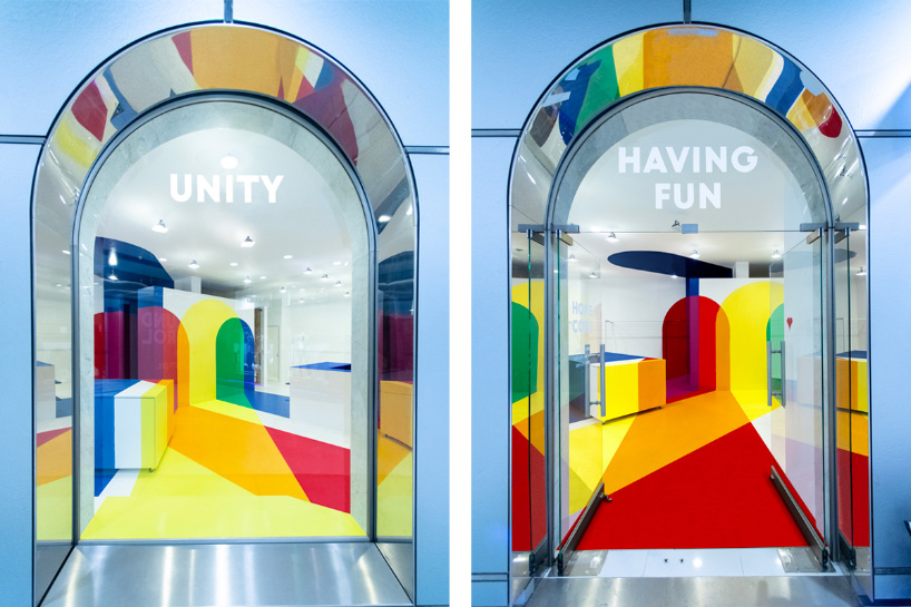
image courtesy of malka architecture
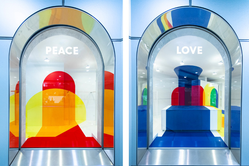
image courtesy of malka architecture
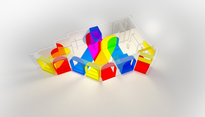
image courtesy of malka architecture
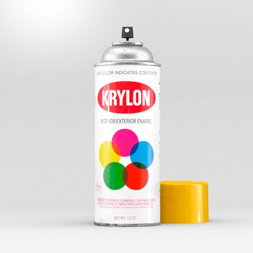
image courtesy of malka architecture
project info:
client: homecore
year: delivered january 2019
type: shop
area: 100 sqm
location: champs-elysées, paris, france
team: studio malka architecture
philip stevens I designboom
feb 09, 2019
The post stephane malka designs chromatic interiors for homecore’s new paris store appeared first on Architecture Admirers.